
Design Editor: Customize the Look of Every Section
Learn how to use the SproutOS Design Editor to customize colors, fonts, layouts, images, and text across your entire website design before exporting.
Phase 2 of 3: Prompt → Sitemap → You are here: Design → Export. The Design Editor is where your website comes to life visually. Every page and section from your sitemap is rendered here as a real design you can customize.
The Design Editor is an infinite canvas where you customize the visual design of every page and section. SproutOS generates a starting design from your prompt and sitemap. You then adjust colors, fonts, layouts, images, and text to match the client's brand. Every change is saved automatically.
The Canvas
The canvas shows your full website design: every page, every section, in order. Use these controls to navigate:
- Pan: click and drag on any empty area of the canvas
- Zoom: use the zoom controls at the bottom or scroll while holding Ctrl
- Fit to screen: click the fit button to see your entire design at once
- Switch pages: use the page list on the left sidebar to jump between pages
Design Panel
The Design Panel is the left sidebar in the Design Editor. It controls the global styles for your entire site - colors, fonts, buttons, and cards. Changes made here apply across every page and section instantly.
The panel includes the following controls:
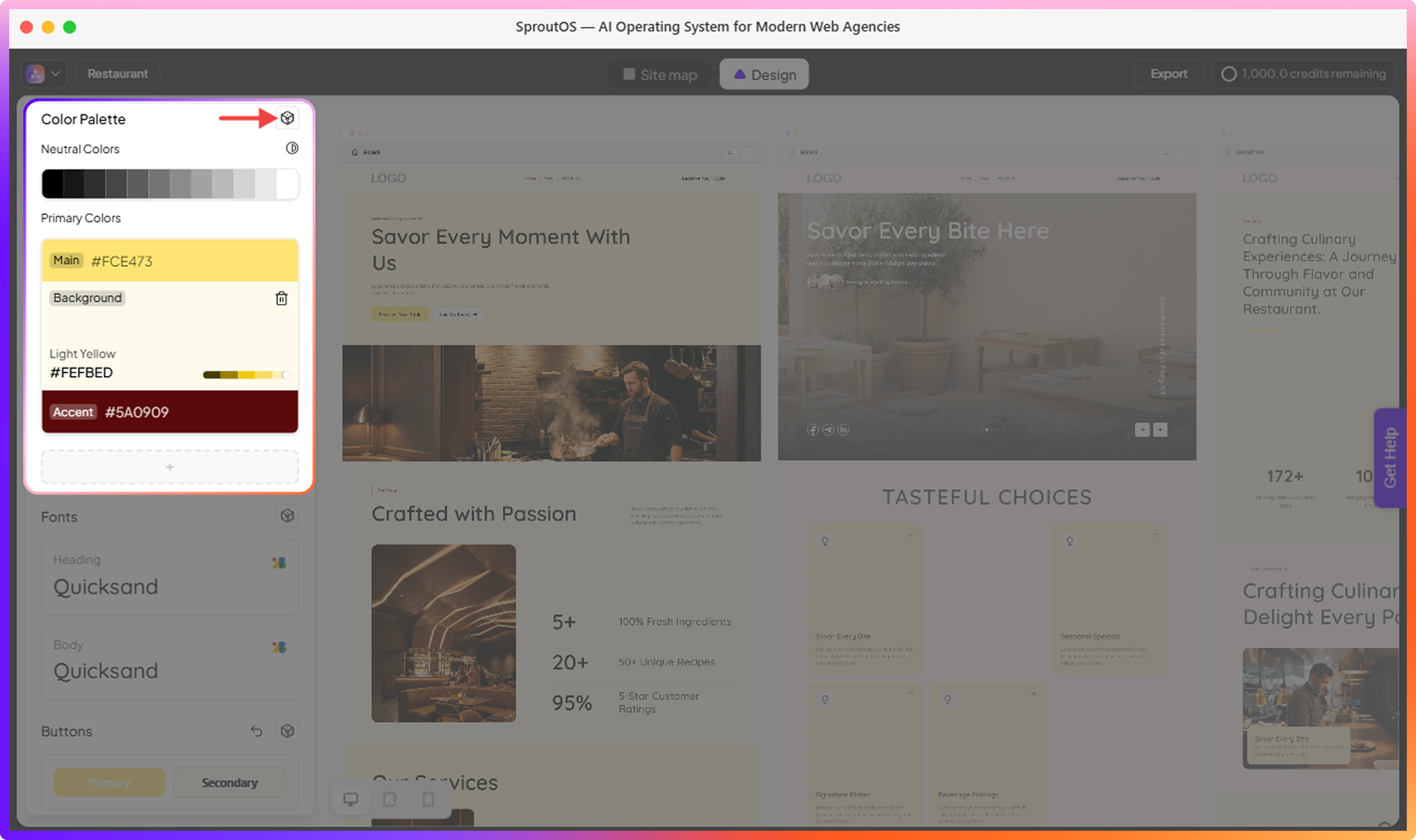
- Color Palette - Set your site's color scheme. Choose from pre-built industry palettes, customize primary and accent colors, and randomize combinations until you find the right look.
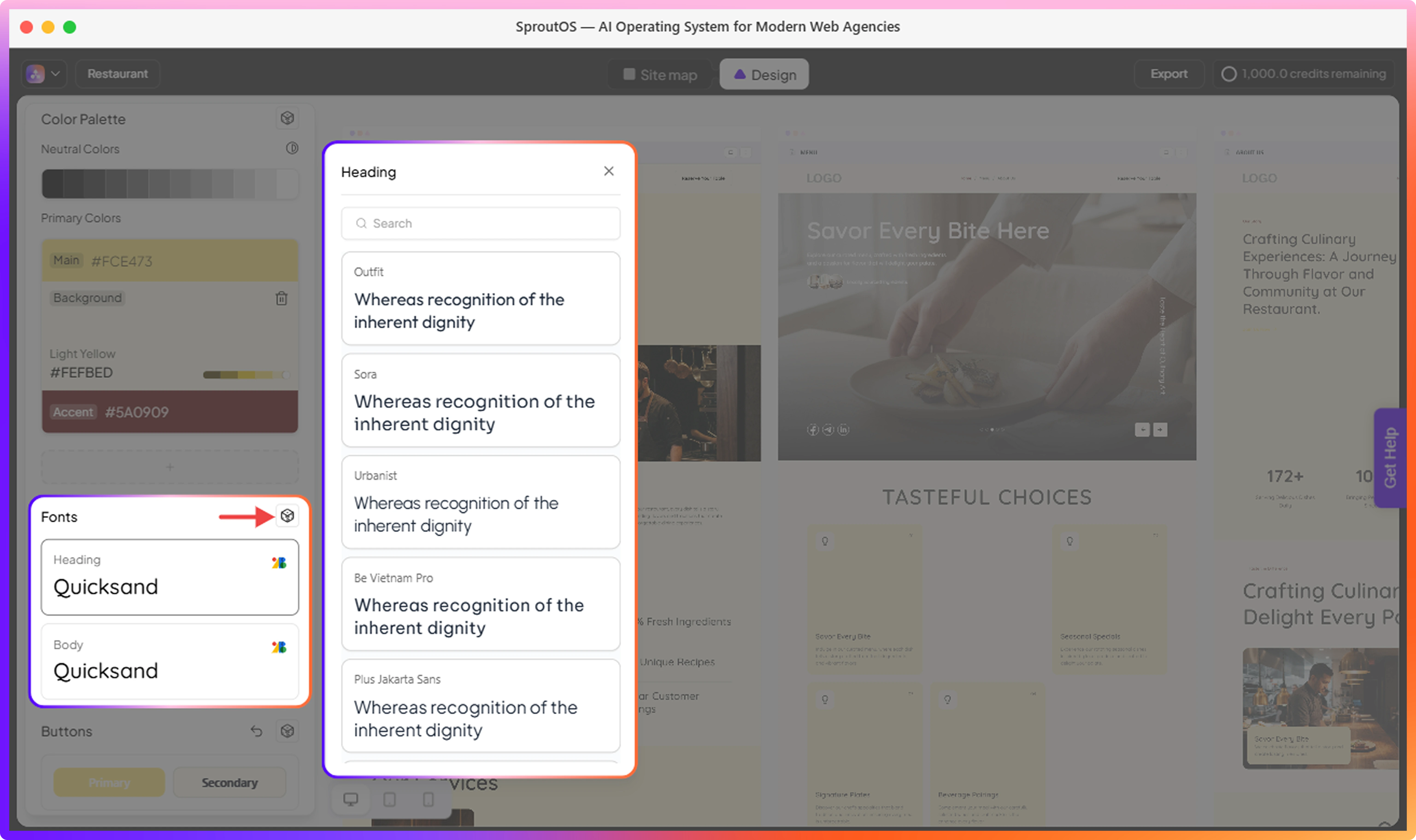
- Fonts - Pick heading and body fonts from 1,000+ Google Fonts. Changes apply globally across every section the moment you select a font.
- Buttons - Control the size, corner radius, icon visibility, and overall style of every button on the site. Use Randomize to explore style combinations quickly.
- Cards - Coming soon.
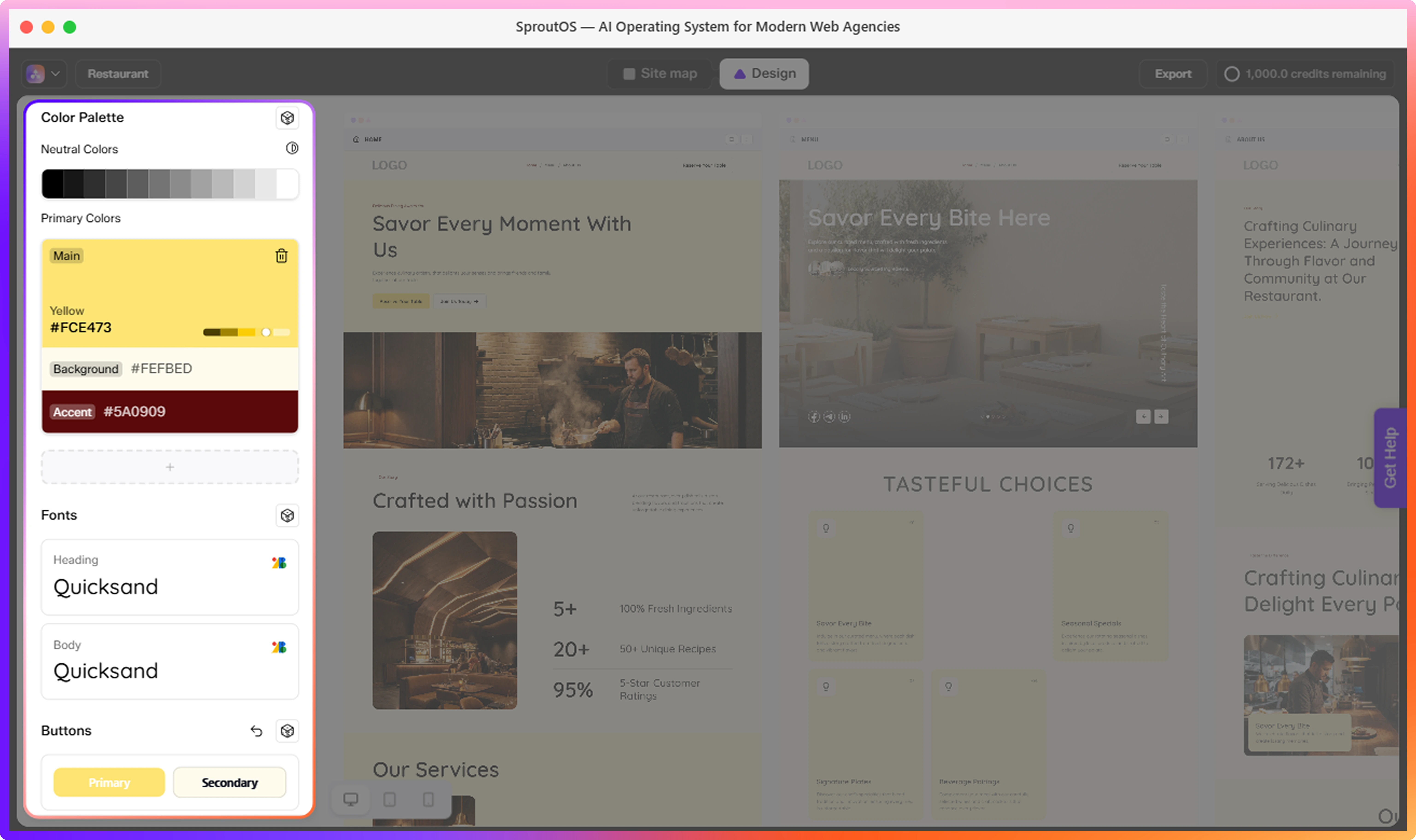
Color Palettes
SproutOS provides multiple pre-built color palettes organized by industry. Switching palettes updates the entire design instantly.
- Browse palettes by industry: Tech, Health, Finance, Creative, and more
- Create a custom palette using hex color input
- Adjust the global saturation slider to make all colors more vivid or more muted
- Click Randomize colors to instantly generate a new color combination based on your current palette
- Add a new accent color using the + button under Primary Colors, or remove an existing accent by clicking the delete icon on it
Try several palettes before settling on one. Switching is instant and you can always go back.
Fonts
Choose from 1,000+ Google Fonts for your heading and body text.
- Heading font: applies to all headings across the entire design
- Body font: applies to all paragraph text
- Search and filter fonts by name or category (serif, sans-serif, display, etc.)
- Font changes apply globally and update every section instantly
- Click Randomize fonts to instantly swap to a new heading and body font pairing
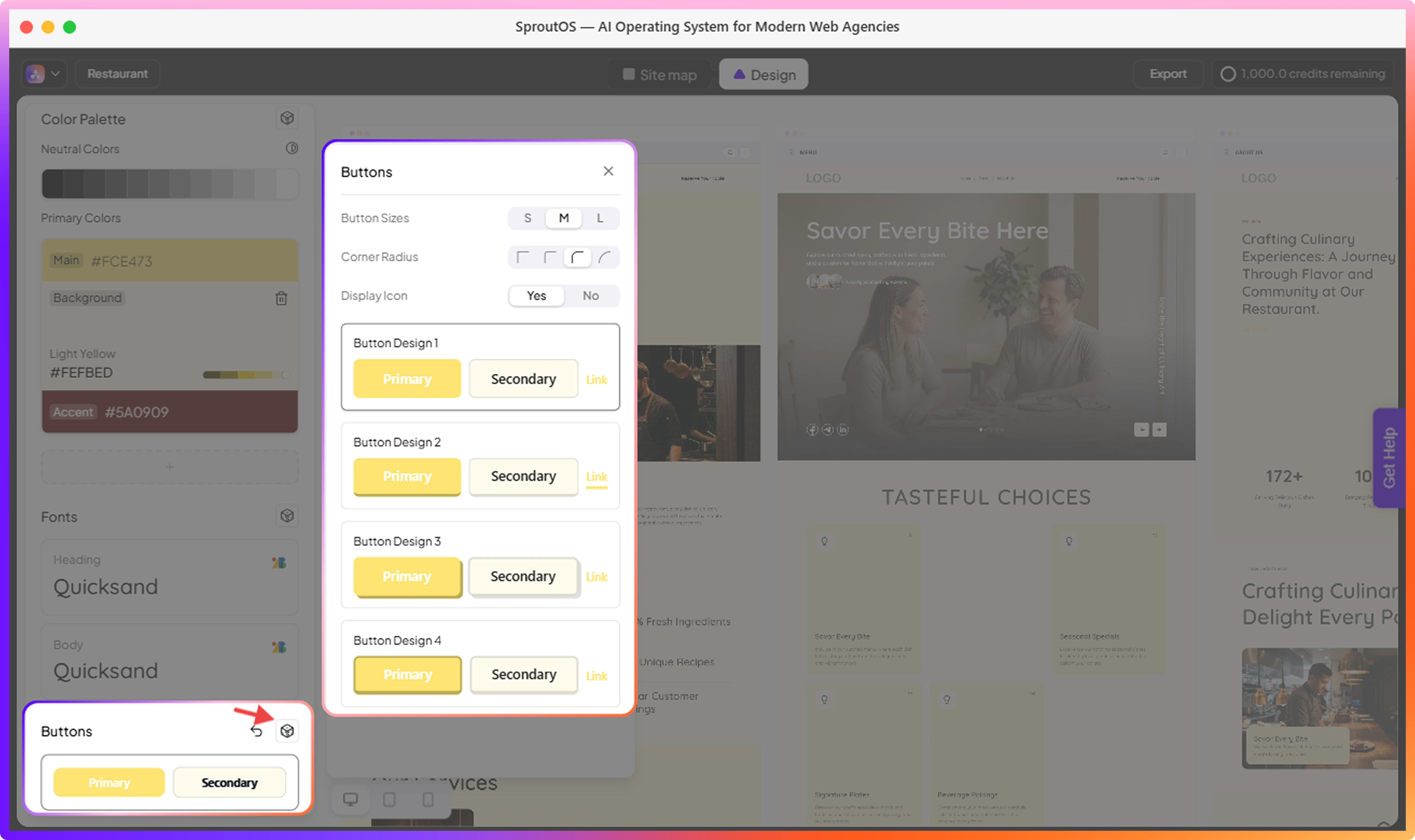
Buttons
The Buttons section lets you control the global style of all buttons across your design. Changes here apply to every button on every page.
- Button Sizes: choose the default button size - Small (S), Medium (M), or Large (L)
- Corner Radius: select from four options ranging from sharp square corners to fully rounded
- Display Icon: toggle Yes or No to show or hide icons inside buttons
Select a Button Design to choose the overall button style. Each design shows a preview of how your Primary, Secondary, and Link buttons will look across the site.
- Click Randomize buttons to instantly generate a new button style combination
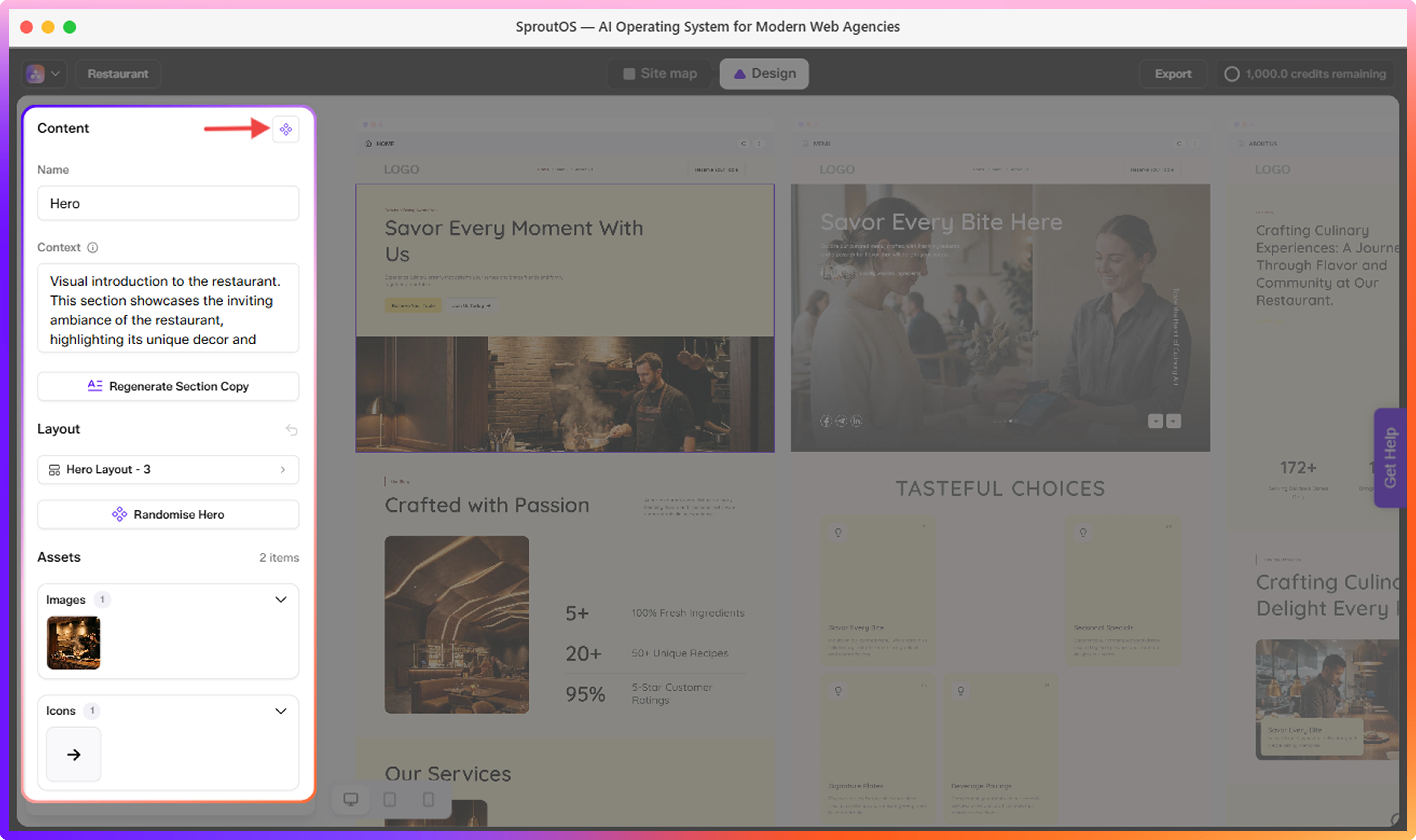
Section Layouts
Each section type has multiple layout variants. Switching variants changes the visual arrangement without changing the content.
- Open the variant panel for any section to browse available options
- AI Picks are highlighted - these are variants recommended based on your brief
- Bookmark variants you like for quick access later
- Search variants by name or number if you know what you are looking for
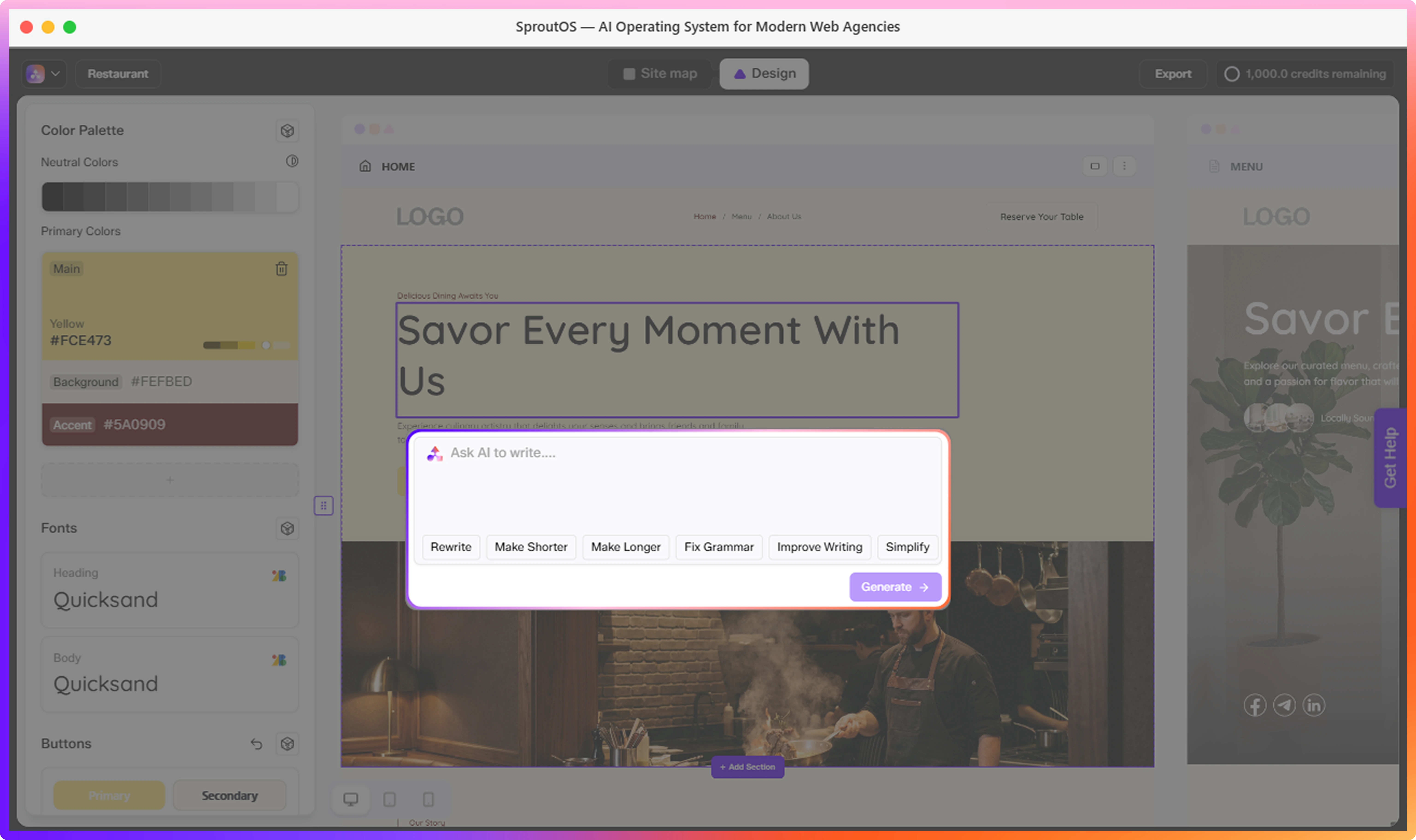
Editing Text
Click any text element on the canvas to edit it directly. Changes are saved automatically.
For AI-assisted editing, select any text element to open the quick actions panel:
| Action | What It Does |
|---|---|
| Rewrite | Rewrites the text from scratch using your brief as context |
| Make Shorter | Reduces length while keeping the meaning |
| Make Longer | Expands the text with more detail |
| Fix Grammar | Corrects spelling and grammar errors |
| Improve Writing | Improves clarity and flow |
| Simplify | Makes the language easier to read |
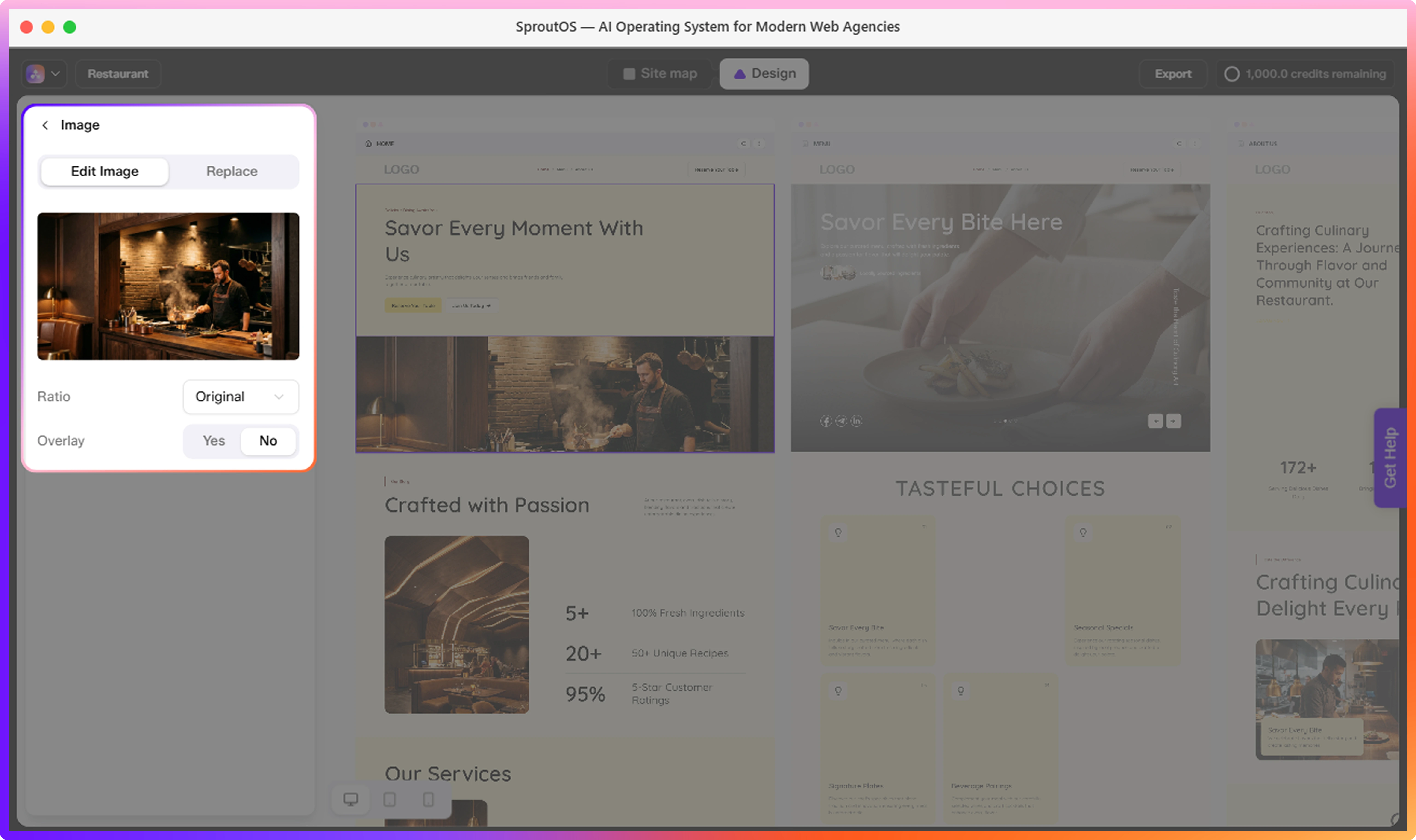
Images
Click any image on the canvas to open the Image panel. It has two tabs: Edit Image and Replace.
The Edit Image tab lets you adjust how the current image is displayed without replacing it.
- Ratio - Choose the aspect ratio for the image frame: Original, 1:1, 4:3, 16:9, or 3:2
- Overlay - Toggle Yes or No to add a color overlay on top of the image, and control its opacity
The Replace tab lets you swap the current image with a new one from two sources:
- Library - Browse the built-in stock image library. Filter by Photos, Art, or 3D, and use the search bar to find a specific image.
- Uploads - Use your own images. Upload a new file or select one you have previously uploaded.
For logos, upload a light and a dark variant separately. SproutOS applies the correct version automatically based on the section background color.
Responsive Preview
Switch between Desktop, Tablet, and Mobile at any time to check how the design looks at different screen sizes.
| Viewport | Width |
|---|---|
| Desktop | Full canvas |
| Tablet | 768px |
| Mobile | 375px |
Design edits are made in Desktop view. Tablet and Mobile views are for previewing only.
Frequently Asked Questions
Next Step
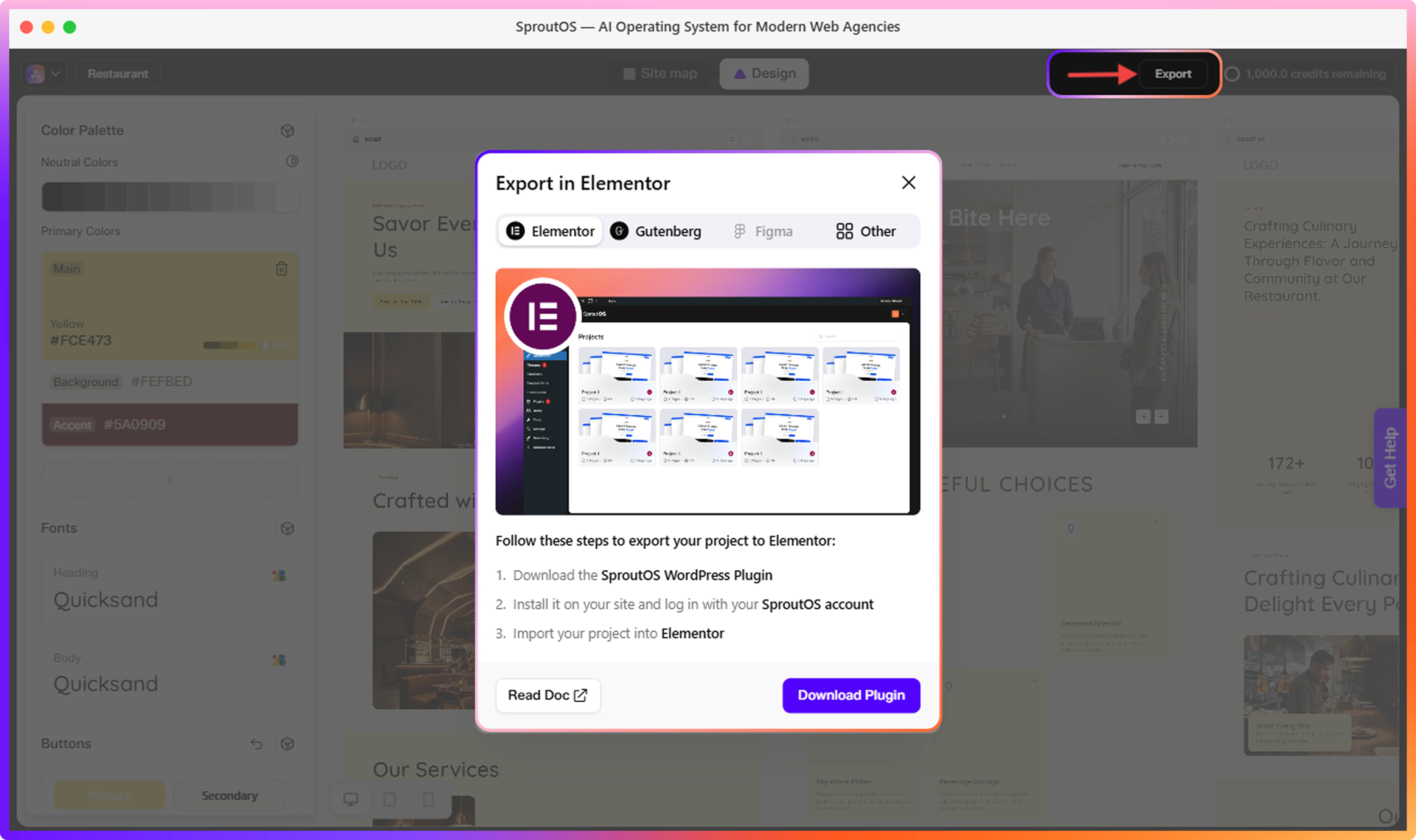
Export to WordPress
Export your finished design to Elementor or Gutenberg.